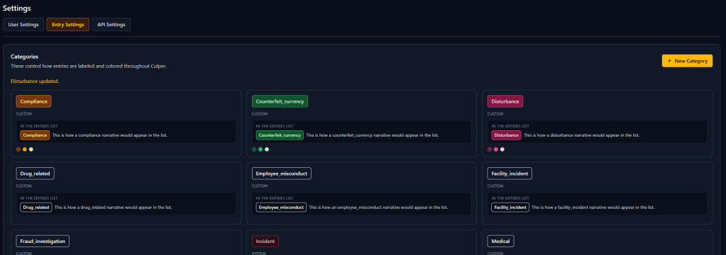
This week’s work in Project Culper split into two threads: fixing how categories are managed, and fixing how the whole app reads.
The category settings page had a UX problem I kept running into myself. It defaulted straight into a “Create Category” form, so every time I opened it I had to back out before I could see what already existed. I rebuilt it around a card grid instead. Each category now shows its actual badge, a small preview of how it looks inline in the entries list, and swatches for its background, border, and text colors. Creating or editing one now opens a focused modal instead of hijacking the whole page.
While I was in there, I added color presets. Picking three colors that read well together on a dark background is not intuitive, so I built eleven ready-made combos, red, amber, teal, violet, and so on, each following the same dark background, bright border, light text pattern the built-in categories already use. One click sets all three pickers at once.
Separately, I audited font sizes across the entire frontend. Almost ninety percent of all sized text in the app was using Tailwind’s two smallest sizes, twelve and fourteen pixels, often paired with dim gray text colors. Nothing was technically bold or thin, it just added up to text that was hard to read at a glance. I bumped the whole scale up one notch and lightened the dimmer grays, across all forty three files, and checked the results against the running app to make sure nothing broke.

